Bold and Bright Colors
The Heartbeat of Modern Visual Design
The phenomenon of color is such an interesting topic. In the modern world of media as a whole, we use it to elicit an emotional response. Think about the lack of color in a breaktaking portrait of an elder states person or that nostalgic holiday film. There’s an emotion to it. Just as strongly we reflect on the oversaturated latest comic book franchise and that one cheap taco ad that keeps slapping you with neon text. The reality is color is a huge part of modern media and the content we consume.
Color in media has an interesting history, but today we’re going to look at color as the lifeblood of modern advertising campaigns, brand identity, and customer engagement.
In this post, we’ll explore the historical evolution of color as a creative force and its commanding role in contemporary marketing strategies. Spoiler alert: it’s all about grabbing attention, triggering emotions, and driving conversions.

The Pioneers of Bold Color in Photography
Before digital billboards and Instagram feeds, photographers were already using color to provoke and engage. Let’s give credit where it’s due.
William Eggleston: Known as the father of color photography, Eggleston’s work in the 1960s shattered conventions by presenting “mundane” subjects in bold, saturated hues. His use of red as a psychological trigger, like in The Red Ceiling, turned everyday moments into emotional landscapes. Eggleston taught us that color is a story, not just an aesthetic.
Saul Leiter: If Eggleston was a punch to the gut, Leiter was a whisper. He layered compositions that bring a sense of surrealism and romance to mid-century New York City. His use of muted palettes to evoke that mood and mystique we, even now, associate with “old New York.” Leiter’s work reminds us that color can be both subtle and transformative.
David LaChapelle: Fast forward to the 1990s, when LaChapelle’s hyper-saturated, surreal imagery dominated fashion and pop culture. Neon walls, jewel tone blazers, and high-contrast lighting that blurred the lines between art, fashion, editorial and advertisement. LaChapelle uses like a weapon, the louder the better and make sure whatever is in the frame, it’s though provoking and impossible to ignore. While we’re not art historians over here at Reactor, it’s hard to ignore how LaChapelle’s themes of consumerism and his unapologetically bold palettes seem to foreshadow, if not lay the foundations, of today’s trend of bright and attention-grabbing visuals in advertising. His work didn’t just reflect the culture, it challenged our idea of it, pushing bold color into the mainstream where it thrives today.
Modern Advertising: The Bold Color Renaissance
So, in the last 80 years or so, bold colors have transitioned from galleries walls to your Instagram feed. Brands now use high-contrast photography and vibrant color palettes to scream “look at me” in a crowded digital space. A few notable examples might be:
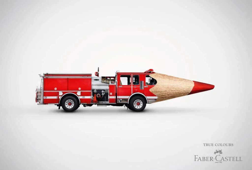
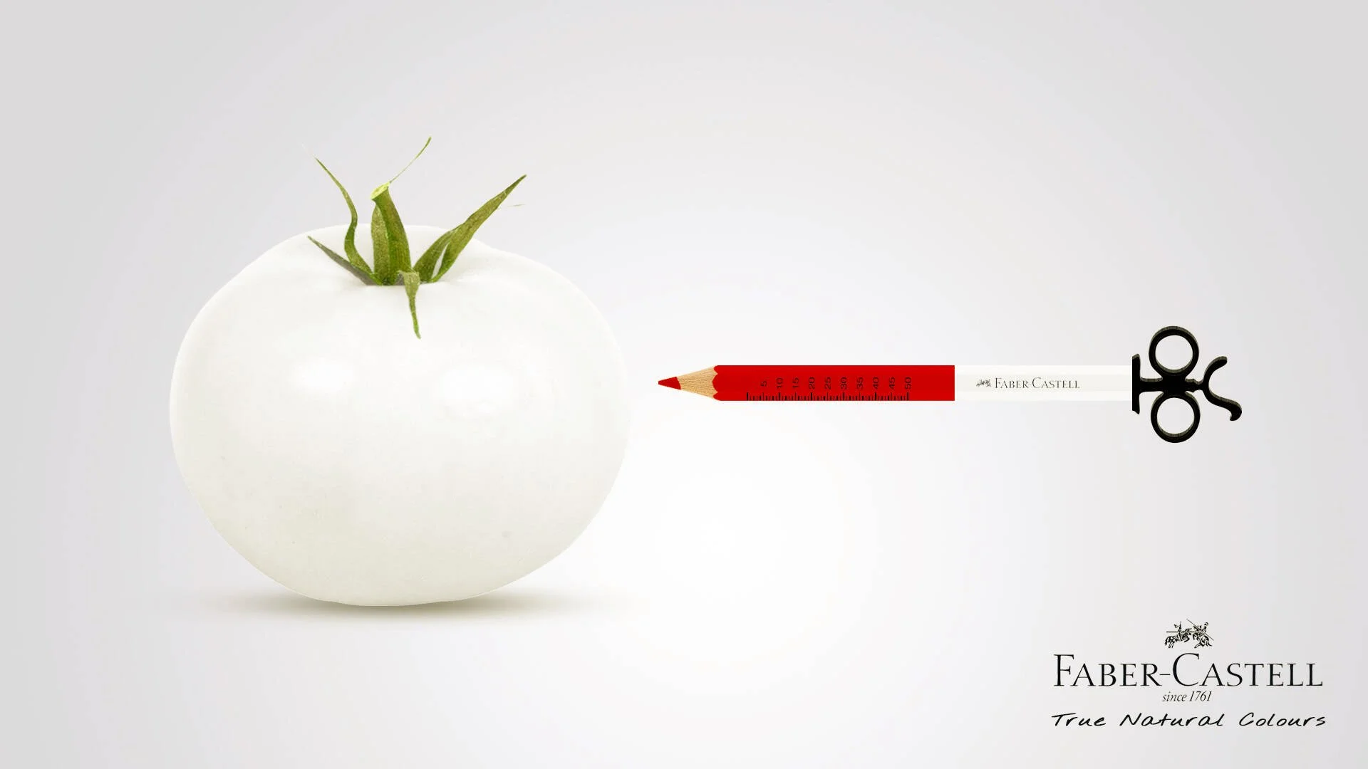
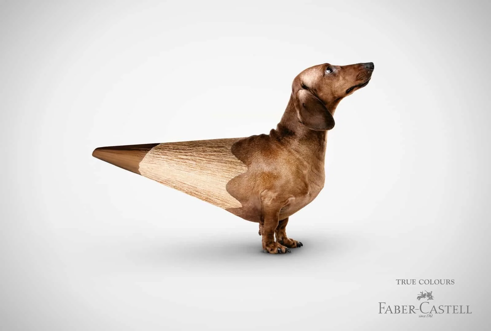
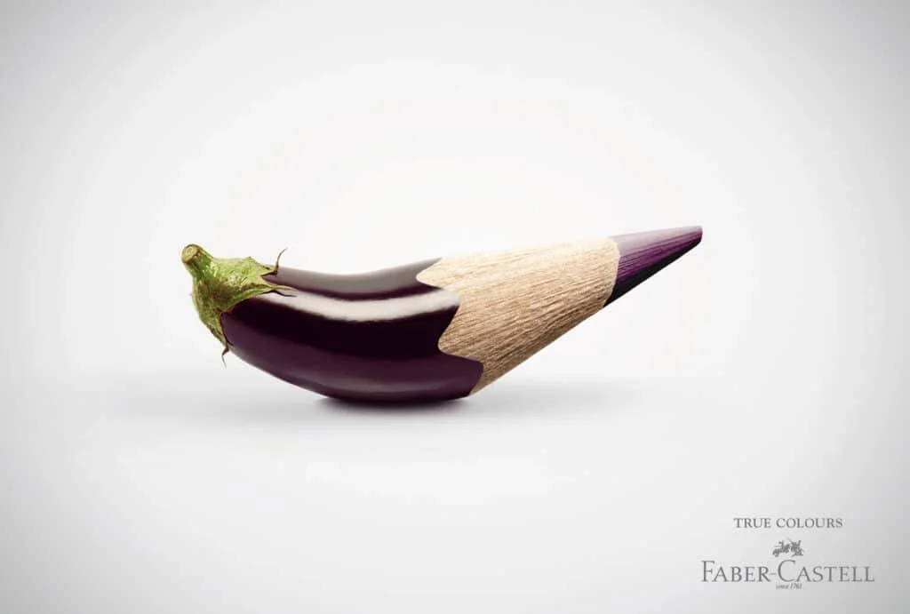
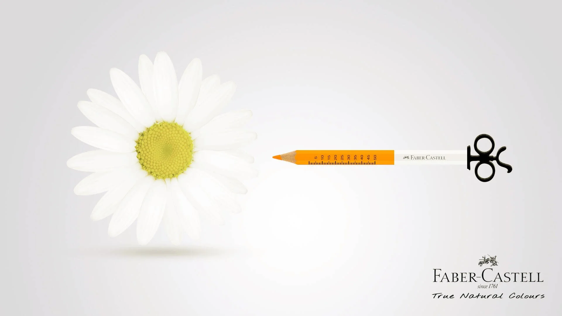
Faber-Castell’s “True Colours” Campaign:
This 2010’s campaign was a masterclass in using bold hues to tell a story. Showcasing the emotional range of their products, Faber-Castell used high-contrast, jewel-tone visuals to evoke passion, creativity, and joy. It wasn’t just about color—it was about how color makes you feel. They followed this up by a True and Natural colors campaign that was really just a brilliant use of color.

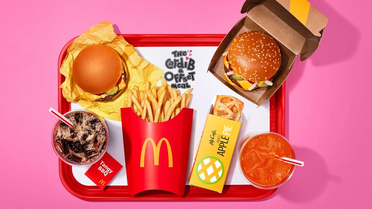
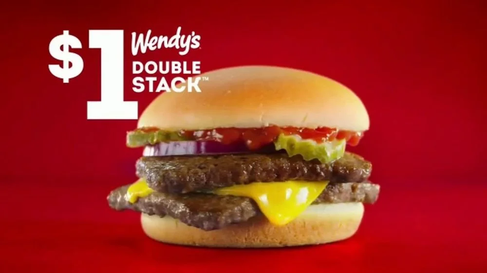
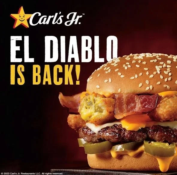
Fast Food Branding of the 2020’s:
McDonald’s red and yellow combo has been burned into our retinas for decades & it’s no accident. Red stimulates appetite, while yellow triggers happiness and optimism. Hello you delicious french fries or is that just a bit of dopamine? Burger King, Wendy’s, and even Hardee’s have leaned into bold color schemes that command attention, we’ve all been victims of the vibrant digital ads, might not go buy that burger - but sometimes you might need a snack after seeing it. It’s not just fast food; it’s fast emotions. When you look at these, if the branding was not on the ad, could you tell who was selling what?

The Psychology of Color in Advertising
But why do bold colors work? It all comes down to our brain and it’s ability to turn any stimuli into an emotional and psychological trigger. Bright, happy tones like yellow, orange, and hot pink are often referred to as “endorphin-producing colors” because they evoke feelings of positivity and excitement, subtly telling your brain, “I like this, and I want more.” Meanwhile, colors like red are hardwired into our psyche to signal passion, urgency, and even hunger, those fast food marketers know this trick well. On the other hand, blue evokes trust and reliability, and green soothes with its connection to nature and calmness. Why do you think there’s so much blue in commercial airlines and hospitals?
But in modern advertising, the real magic seems to begin with high-contrast combinations. When neon green copy hits that pure black background like a paint splatter or when a woman dressed in an electric purple dress dances on a bright yellow set. These are attention magnets, designed to stop you in your tracks, weather mid-scroll or grabbing your eye in a crowded space. I’ll stop so short of calling it manipulation, but suffice to say, these color combinations are chosen so audience will stop, feel something, and hopefully, take action.
Trending Now: Neon, Jewel Tones, and Surrealism
If you’ve noticed a flood of jewel tones and neon vibes in your social feeds, you’re not alone. Today’s top brands are capitalizing on these trends:
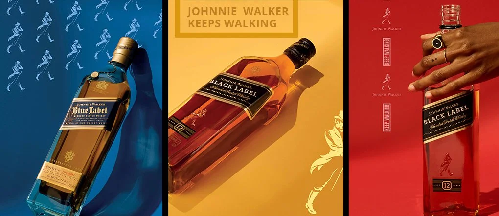
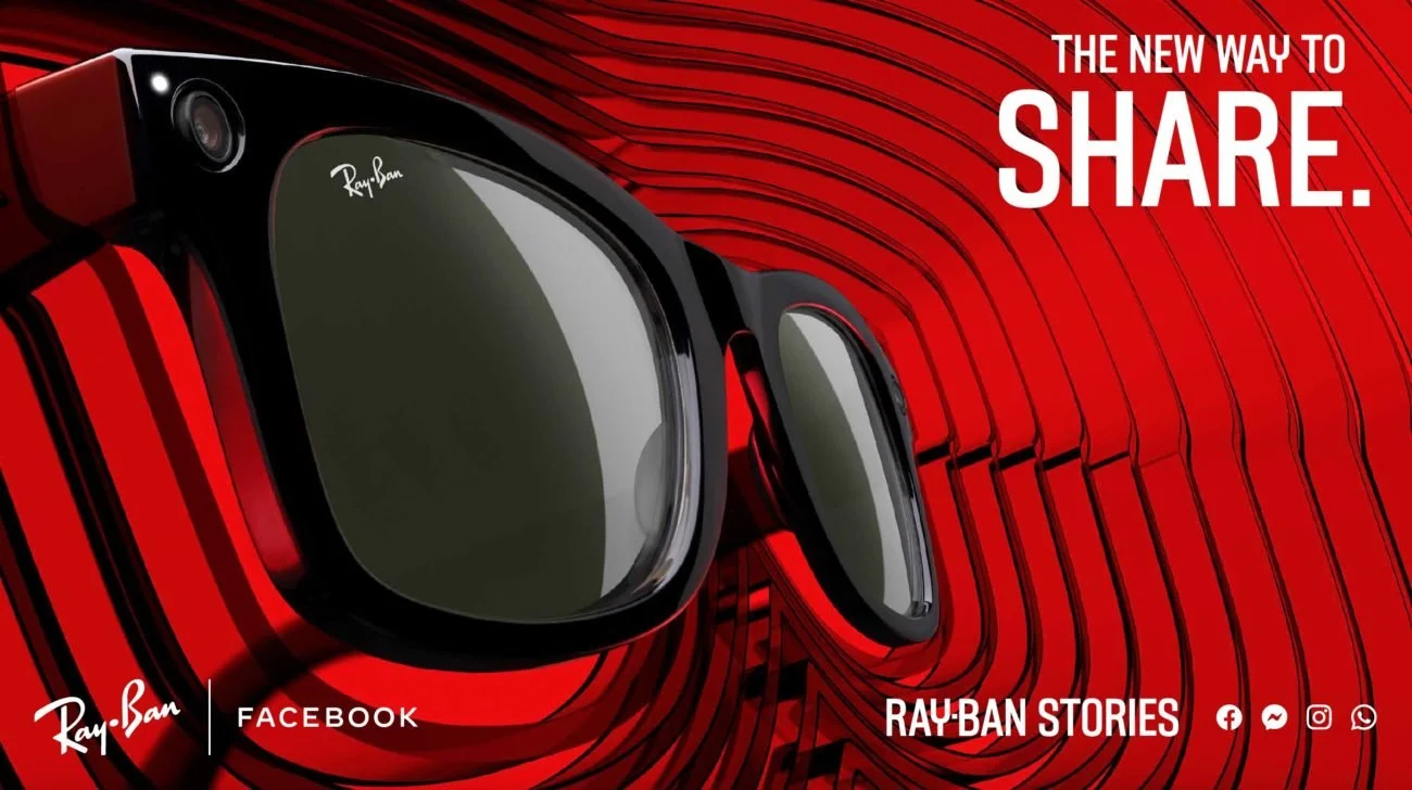
Neon and Jewel Tone Marketing: Bold, luxurious, and unapologetically vibrant, these palettes add a sense of urgency and even in some cases used to add touch of sophistication. Think the 2024 Johnny Walker campaign, expensive whiskey is so classy.
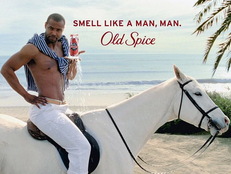
Surreal Brand Imagery: Inspired by Andy Warhol and David LaChapelle brands are diving into surrealist visuals that look like dreams or in some cases acid trips. The Old Spice campaigns of the mid 2000’s are great examples. And with the advent of generative AI this trend is just going to continue.
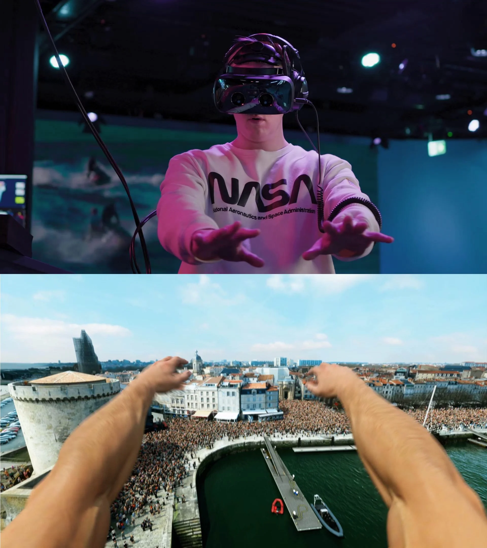
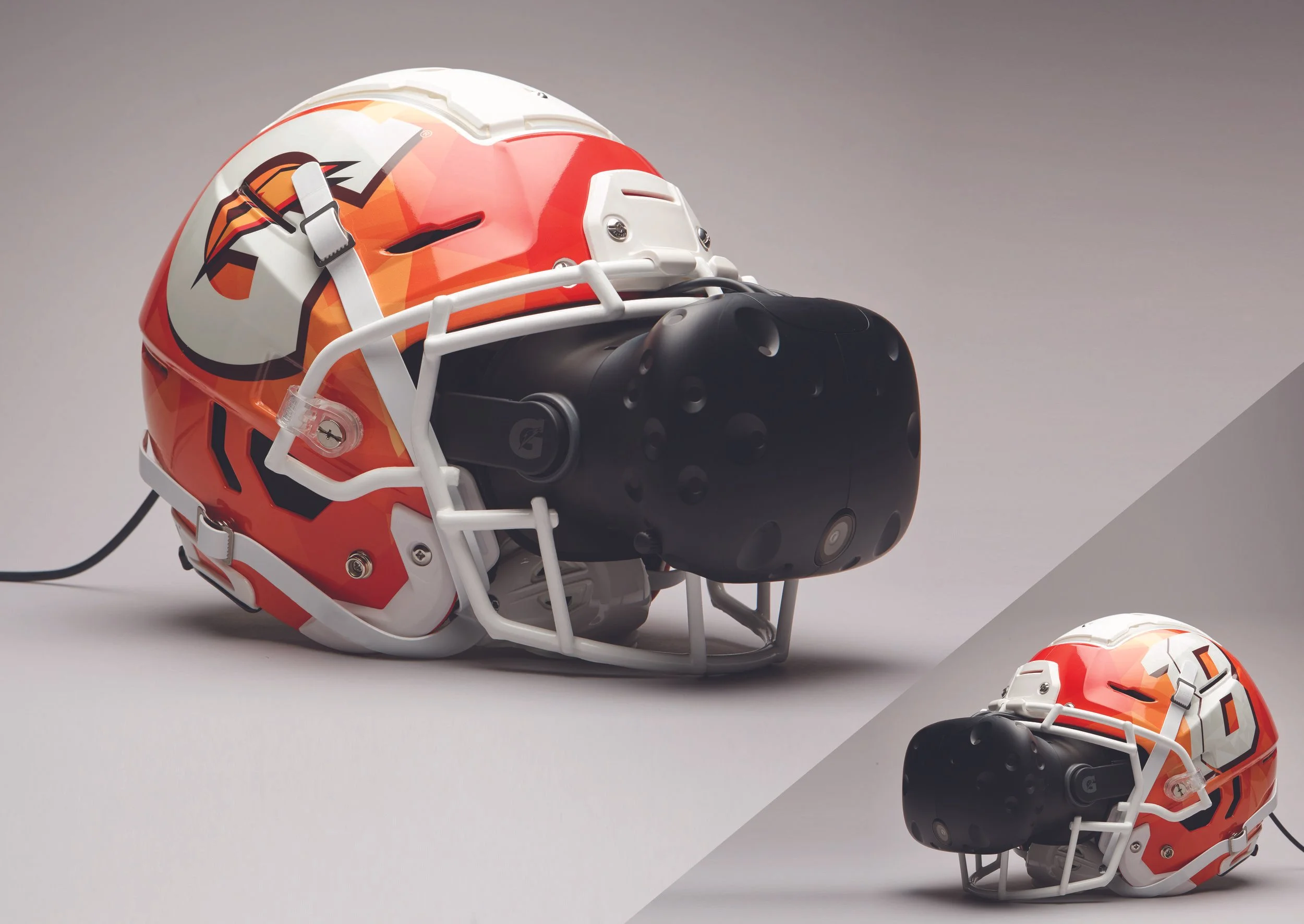
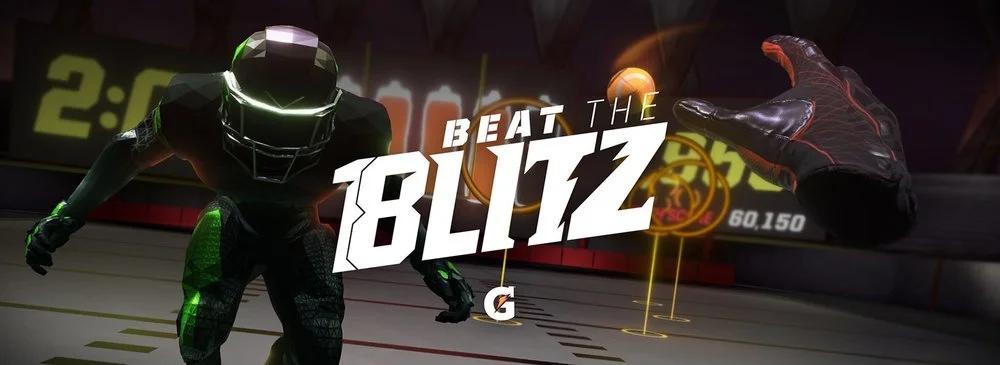
Fully Immersive Visual Content: When Unreal Engine first dropped, video walls were mostly reserved for concerts and avant-garde films. Now, that same tech lets designers think in 360°, breaking beyond traditional screens to create fully immersive campaigns. Whatever filter, color, or texture they can dream up can now be brought to life—turning bold colors into experiences rather than just visuals. Brands like Gatorade, Red Bull and Pepsi have been ahead of the game for years, but we’re on the verge of an explosion in this style. The lid’s about to come off, and immersive, high-intensity visuals are about to be everywhere.
These trends are not just about aesthetics; they are about trying to create even more engagement, capture that little bit of attention you have to give, and fuel that bright and carefree moment to get lost in.
The Carefree Life: Selling Positivity Through Color
In a world weighed down by uncertainty and chaos, many brands are leaning into the “carefree life” narrative to offer an escape. Bright, positive colors like sunny yellows, playful pinks, and sky blues are being used to evoke joy, freedom, and hope. The hope is to create emotional connections that feel like a breath of fresh air. An uplifting visual to try and counterbalance the constant noise of daily life.
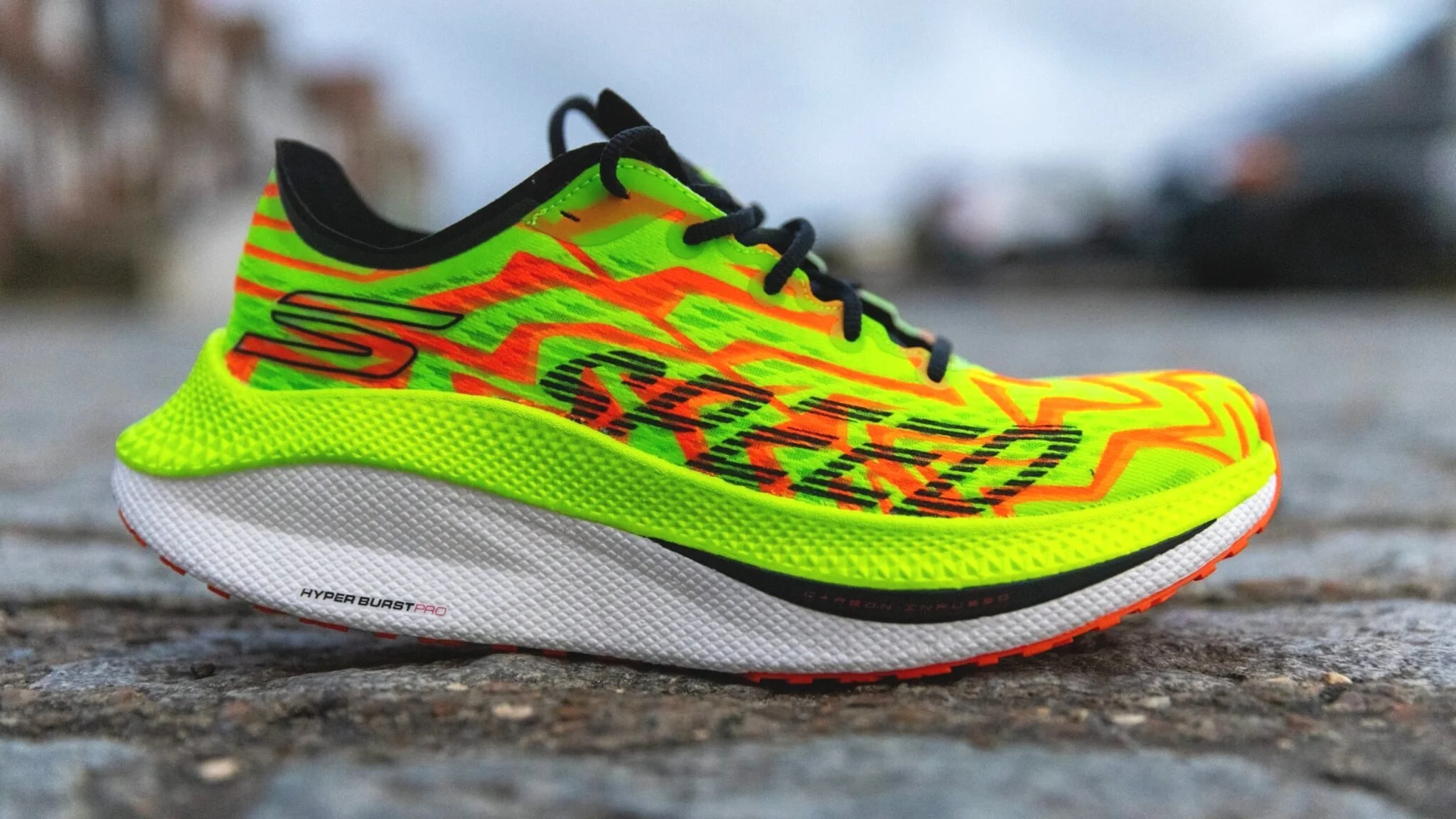
By using bold, cheerful hues, we can tell stories of empowerment and individuality. Activewear and wellness campaigns, for instance, often rely on high-energy neon tones to symbolize confidence and vitality, while lifestyle brands use softer brights to sell the dream of happiness and connection. For many of these campaigns it’s not just about grabbing attention; it’s about tying color to a deeper emotional promise. Buy these neon shoes, we bet you can run faster. Or, see how happy this family is? They’re bathed in beautiful yellow sunshine, and if you take these probiotics you too can be in this moment with us. It works, and the landscape is getting louder.
The “carefree life” message is clear: life can be exciting and full of possibilities and “this” product will help you get there.
Why Bold Colors Are Here to Stay
Let’s cut to the chase: bold color isn’t just a trend; it’s a tool. From when Eggleston decided to frame the shot so we feel those reds to a modern chicken restaurant's use of only red and white in contrast, color has proven its ability to engage, inspire, and create conversations. Whether you’re an art director, a marketer, or an agency trying to make your mark, bold colors might be your secret weapon. But knowing that and knowing how to use them effectively? Two very different things.
Embrace the neon, crank up the contrast, and make your visuals impossible to ignore. Just make sure it’s done right the first time. In a world full of noise, bold color screams the loudest but only when used strategically. Because the wrong shade of neon pink? It’s not screaming; it’s yelling. And nobody likes to be yelled at.
Need a little help? We got you. We study this stuff like your uncle studies the Detroit Lions. We know how to make bold work for you, it’s what we do. Let’s make your visuals impossible to ignore and impossible to forget.